
Branding
Website
A property management brand built from a blank page
Maplewood Management decided to rebrand in early 2026. They came to us with an informal list of services and a few logo ideas, and details, or website yet. We built the brand, organized their services into clear pages, and launched a site that can grow with them.

Brand new
At a glance
Client
Maplewood Management
What they do
Commercial property management across several property types
What we did
Logo and brand identity, sitemap and wireframes, service content, website design and build
Built on
WordPress, Adobe Illustrator
What they launched with
A sharp new logo and a brand that looks established from day one.
Service content that explains what they do in a few clear pages.
Five property type pages, from commercial to storage, each ready to rank on its own.
The brand board
A new company doesn’t have years of recognition to lean on, so every piece had to make Maplewood Management look established from the first meeting. Here are the pieces, and why each one is there.
The mark: a maple leaf with a house cut in
The mark is a copper maple leaf with a house cut into it, paired with the name in Futura PT Heavy. It works on signs, documents, and the web.
Why it matters: It gives a brand new company a mark that feels steady and memorable from the first meeting.
Color and type: warm and grounded
Futura PT throughout, with deep browns, beige, and off-white, plus copper and green accents. Each property type page gets its own accent color.
Why it matters: Commercial clients want a partner that feels solid, not flashy, and the accents help each page feel like its own place.
The voice: services you can scan
Short, direct service cards for each core offering, plus a page for each property type they manage: commercial, industrial, residential, retail, and storage.
Why it matters: Owners find their property type fast, and each page gives the site more to rank for.


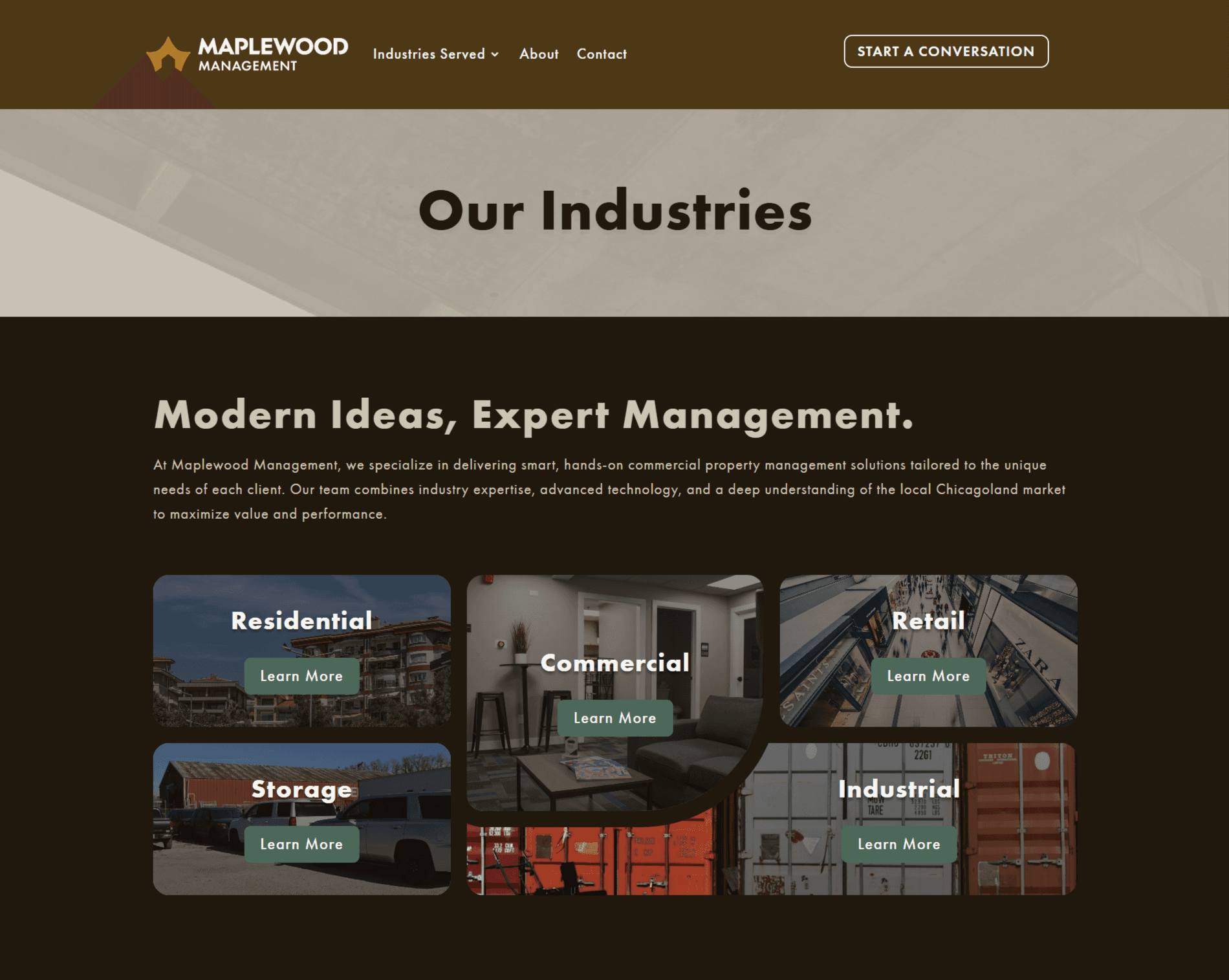
From blank page to open doors
We built the brand, the sitemap, the content, and the site on one foundation instead of running three separate projects, leading up to Maplewood Management opening in the spring of 2026.
Step 1
Brand
A logo, a type system, and a color palette, built around a copper maple leaf with a house cut into it.
Step 2
Sitemap
We mapped every page and how visitors move between services before anything was designed.
Step 3
Content
We gathered the service information and wrote all of it into short, clear sections.
Spring 2026
Launch
The site went live with contact buttons and a lead form on every page, ready for Maplewood Management’s clients.
Questions about this project
Can you build a brand and a website at the same time?
Do you write the website content for a new business?
Can we add property types or services to the site later?
More work we’re proud of
Photo or screenshot: Plandscape

Website · Landscaping
Plandscape
A full website redesign for a high-end landscaper, built around their projects and easy for their team to grow.
Photo or screenshot: Norris Cultural Arts
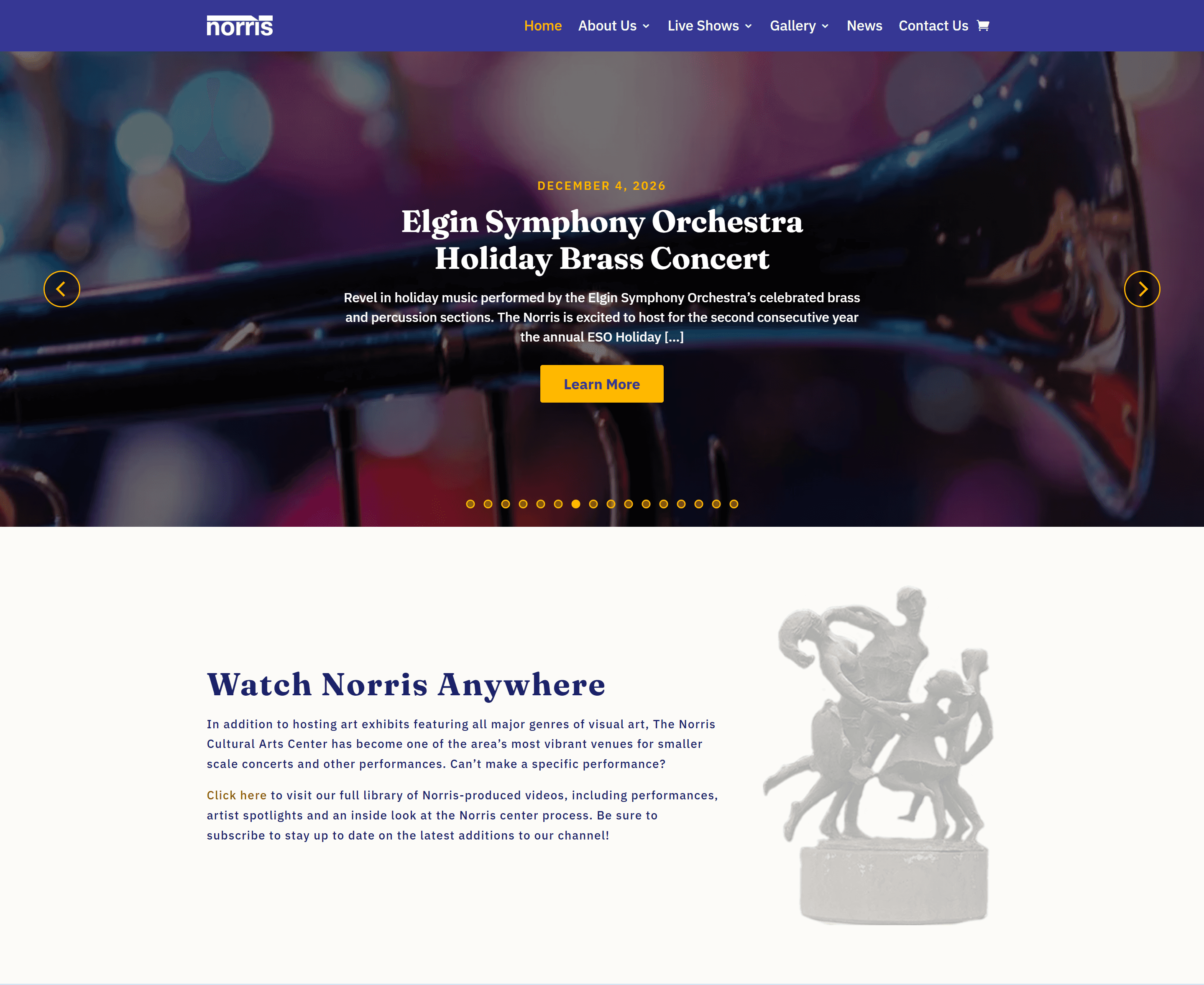
Website · Nonprofit
Norris Cultural Arts
A new site that makes it easier to find what's happening and easier for their team to keep updated.
Opening your doors soon?
Tell us about the business and the clients you want.